Task 6/1 brief:
The spatial arrangement of the components of a composition can unite, divide, evoke emotion, movement and/ or give a sense of direction.
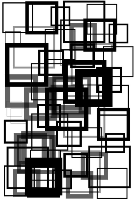
Using an equilateral triangle, a square and a circle or combination/multiples thereof as your components, arrange them into a composition in a square format with the intent of visualising the following words.
Tension, playful, congested, increase, orderly, disorderly, Symmetry/ Asymmetry, Direction.
The size of the overall surface area i.e. the square, and the size of the components of the compositions i.e. the shapes you are using, are up to you.
Consider scale, overlapping, cropping and bleeding. You may only use one colour but may use tones of that colour.I first started off by representing these emotions in the shapes that I was asked to use. I started off by sketching out designs for each emotion for a page of A4; I wanted each design to be consistent with each other.


Illustrator Designs.
I then proceeded the process, by choosing three sketched that I felt that was good at provoking the emotion on the page, using the shapes instructed. I chose congested, playful and orderly, from the first set of designs.

I scanned through the design onto the computer, as I had got advice from a lecturer saying they liked the roughness of shapes and how they are not all in line with each other. I filled some of the shapes with solid colours, as I felt that it gave more dimension to piece and it evoked the emotion of congested.
I had got some criticism of this piece, by a lecturer, who had said that it was not congested enough, and the shapes needed to be square, as I did not follow the brief, by using the correct shapes that were said in the brief.

For this design, I wanted to stick with the theme of using a calligraphy pen to make the design seem rough and playful. I made the shapes of various sizes, I changed the orientation of some of the shapes, to emulate kids playing, as they are known to run about everywhere. I used and outline for the shape, as I felt that it gave more space on the page and it evoked the emotion of playful.
I had got some criticism of this piece, by a lecturer who had said the shapes needed to fit the brief.


I scanned through the design onto the computer, from my sketch book. For this design I wanted to emulate an order in Que, so, therefore, the design of the shapes follow the cue, the design could also mimic direction as it shows an end point.
The first design I felt looked too messy for orderly, so, therefore, the second design, I made the shapes consistent with each other. For the design, I used various tones of black, as I felt it showed a story from the first shape to the end shape; I wanted the various tones of black to emulate the idea of waiting for a cue.
I had got some criticism of this piece, by a lecturer who had said the shapes needed to fit the brief.
Second Set of Designs.
For the second set of designs, I wanted to rectify all the issues I had with my first set of designs, so, therefore, I was following the brief correctly to the way they want.
For this I was inspired by the London Underground For this design I improved the design using by making different size squares, I used various stroke sizes, for each square, emulate different levels of congested for each square. I overlapped the squares on top of each other, to emulate congested; I wanted the squares to fit the whole entire page, to emulate congestion on the tube at peak times on a weekday.

I improved the design by using the shapes that were said in the brief; I used various tones of black to give it more of a happy and playful feeling, with the lighter tones of black. I kept the design near enough the same as the first draft, as it felt that it evoked the emotion of playful quite successfully.

For this design. I changed it quite dramatically from the first draft. I simply made a line a to emulate a cue with many shapes on top of each other; this design could also be interpreted as direction as well, as it is showing from point A to point B.
For this design I wanted to emulate an order in Que, so, therefore, the design of the shapes follow the cue, the design could also emulate direction as it shows an end point.

I decided to undertake another design, as I felt that orderly could be interpreted as different emotions, by simply changing the way the objects are placed on the page.
I placed the objects on top of each other to emulate the emotion of tension. I feel this design is quite successful as it has used the previous design to evoke another emotion in a different way of placing the objects. I used the various tones of black to show how the tension builds up from the top to the bottom, with the bottom of the shapes, getting most of the tension, as this is shown by the lighter shade, as it can emulate suffocation.
Task 6/2 brief:
Record a conversation between two or more people or listen to a podcast or a radio show. Represent the conversation using spatial arrangement.
Think about pauses, intonation, volume, turn-taking. Think about emotions such as tension, playfulness, order/disorder, balance, and direction.
Research


I had done some research prior to designing for task 6/2. I looked at one particular page which looked at words, and represented them in dots; the page itself looked like somewhat technical and I wanted this feeling to come across in my design, as I thought about looking at sound waves of the voices.
Video
I found a video in which three people are talking about science in a serious yet funny way. I chose this conversation as the all three individuals had different accents, and I could represent this in the way of various types of font
Transcript
I transcribed the video.
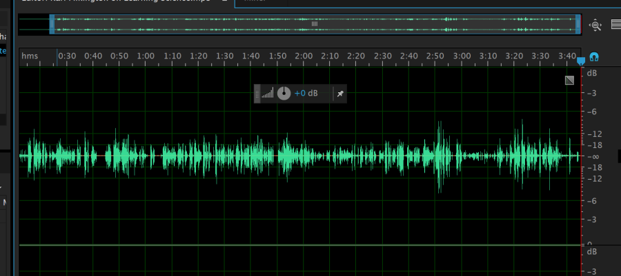
I first placed the clip on Adobe Audition, so, therefore, I could get a much clearer idea of where the pauses are, also the tone of voice and the overall length of sentences. I used this information to help me complete my spatial arrangement of the converation.
Designs

I first looked at how I could represent the data I collated, from the transcript and task 6/1. I wanted to use the information I made in 6/1 to represent the data in that form in the way of type.
For the sketches, I used a wave like an effect with different length poles, as I felt it represented a chit chat sort of conversation as well as the tone a length of conversation of the three individuals.
Test Designs

I wanted to make the sentences fit the length of the line, as that is how long they talk for, I would also make the colour tone suit the way they talked; for example, if they talked quietly the tone of black would very light, and the opposite if they talked loudly. I also overlapped the text over each other when they talked over each other.
Final Designs

I chose a typeface for each person. I chose the particular typeface as I thought is best represented their accent, the way they talked, and the particular language they used to explain what they were saying.
For KARL, I used the typeface Orator Std, medium; as it was separated and in capital letters, I thought this suited his accent has he elongates his words when he talks. His words tend to be thicker than other individuals in the conversation.
For RICKY, I used the typeface Nueva Std, condensed, as Ricky accent is quite posh, and he tends not to elongate his word’s unlike Karl. Ricky’s words tends to be shorter and faster when he is talking. Ricky tends to be happy when he talks and the typeface emulates that with the sanserif typeface, but it is also rounded.
For STEVE, I used the typeface OCR A std, regular, I though this typeface suited Steve bests, as he does not speak as much as Ricky or Karl, he tends to think about what he is going to say, which can make him seem a lot clever than Ricky and Karl.

Karl Spatial Arrangement black background

For the final design, I wanted to use my first sketch for the design of my spatial arrangement. I used a wave like an effect with different length lines, as I felt it represented a chit chat sort of conversation as well as the tone a length of conversation of the three individuals. The length of the line represents the tone of voice, I also used this information to affect the tone of colour I use to represent this information. I looked at the size of the font, and how it changes to the pitch of voice they use; for example, when someone shouts they font gets larger and dark in colour, but if they are quite
The length of the line represents the tone of voice, I also used this information to affect the tone of colour I use to represent this information. I looked at the size of the font, and how it changes to the pitch of voice they use; for example, when someone shouts they font gets larger and dark in colour, but if they are quite
I looked at the size of the font, and how it changes to the pitch of voice they use; for example, when someone shouts they font gets larger, and also darker in colour, but if they are quite the type will be small and light in colour.
The gaps in the wave represent the pauses in the conversation. The overlapping text shows when someone is being talked over and also when they are ignored, this is shown by the different tone of colour used.
